YPTC helps clients visualize their financial and nonfinancial data on a monthly, or even daily, basis. One of the static graphic capabilities that can help nonprofits better understand their data is the Sankey Chart. Read on to learn more about The Sankey Chart and what it shows.
What is a Sankey Chart?
A Sankey Chart is a type of flow diagram that shows how things change, as well as tells data stories.
What types of data can be shown in a Sankey Chart?
Sankey Charts are best at showing how things change from state to state.
What is needed to create a Sankey Chart?
Generally, a countable group of things that are of the same type is required to create a Sankey Chart. This includes items such as dollars, hours, or staff. From there, a flow, a network, and a series of states to show how the data is connected, is required.
How can a Sankey Chart help visualize data at a nonprofit?
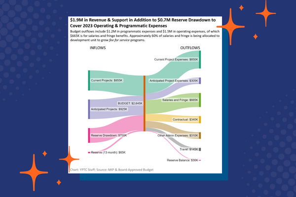
The Sankey Chart’s ability to show how things change from state to state is invaluable to nonprofit leadership. For example, it can show how a dollar began as revenue from a particular funder and ended up as a payment towards an expense. In this way, the Sankey Chart can help to tell an organization’s financial story.
YPTC helps visualize information clearly in ways that are easy to understand. We work with many kinds of quantitative data, including financials, program data, fundraising, and others, building custom infographics and dashboards that can be tailored for delivery in print, PDF, web pages, and mobile apps. For more data visualization examples, visit: https://www.yptc.com/data-visualization-graphics-showcase/
To get started with YPTC Data Visualization Services, contact us below!


